
Over 300 million people worldwide experience colorblindness, often in silence. For children, confusing colors while drawing with friends can shape their relationship with art—and with others. As they grow, they encounter everyday systems that overlook their needs, making navigation and daily life more challenging.
Crayola’s The Color Collective: We're Taking Shape is on a mission to redefine how we see color by pairing hues with shapes- so everyone is able to create and navigate confidently.
Product Redesign
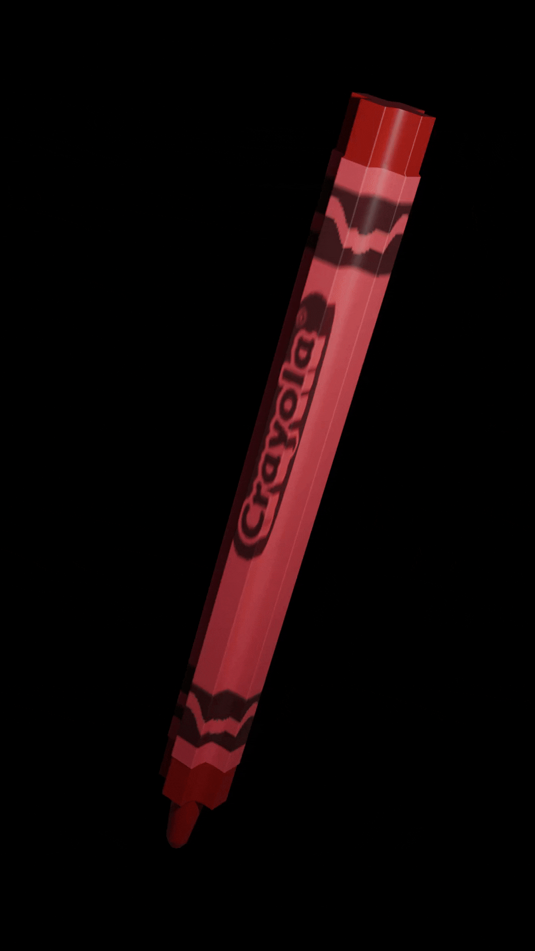
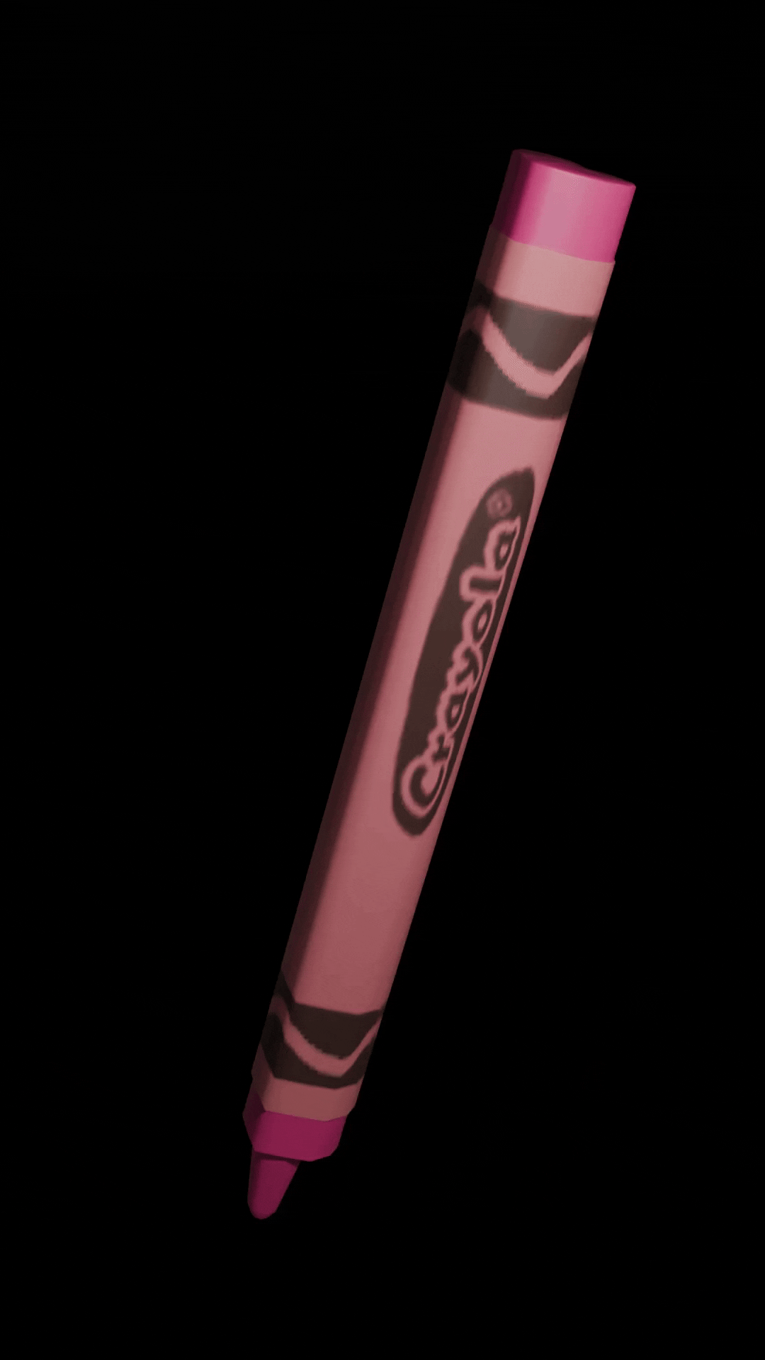
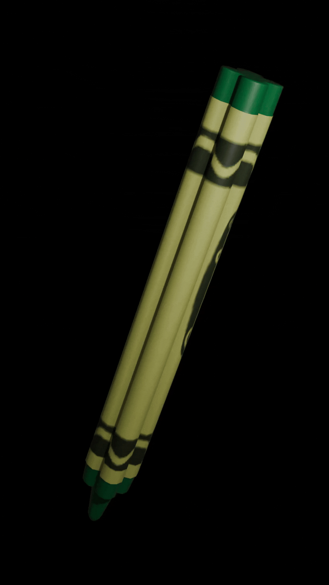
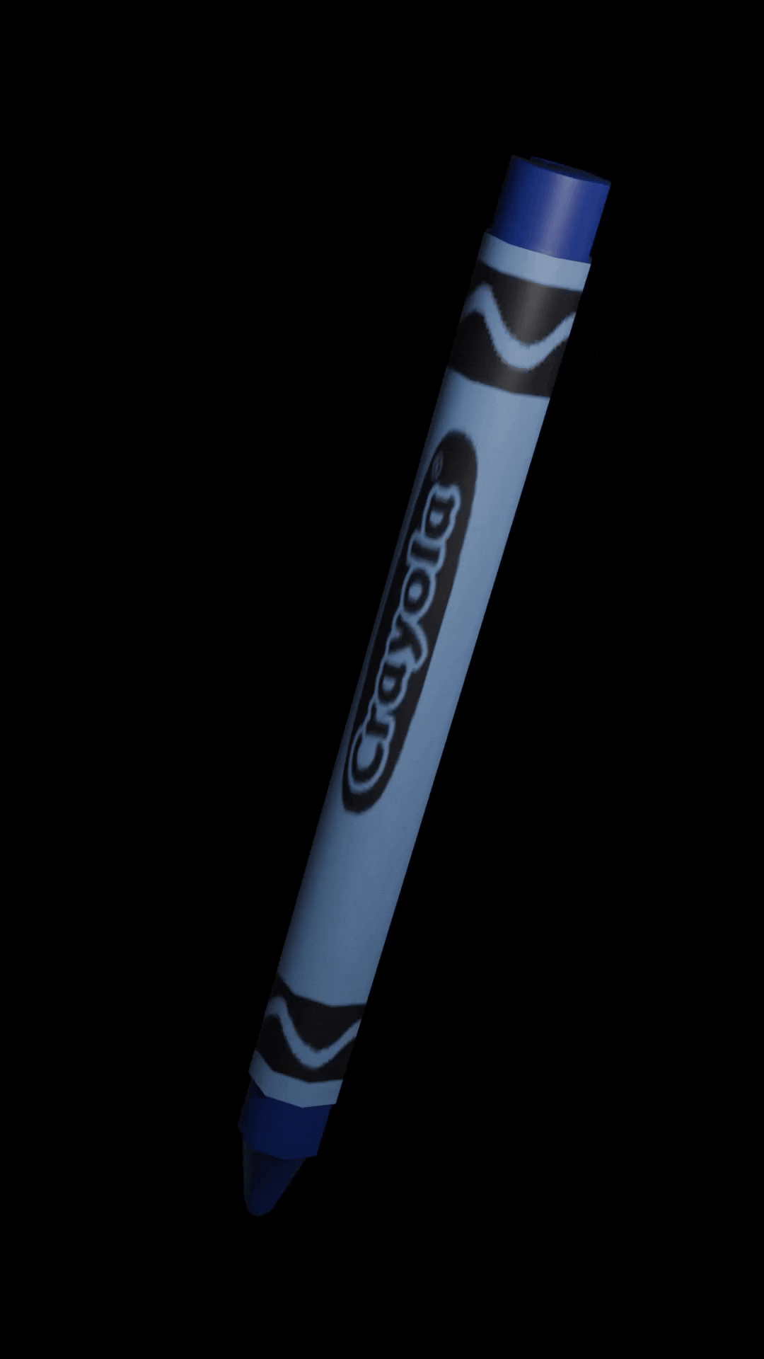
When labels inevitability rip off of crayons or crayons break in half, colorblind individuals have no way to distinguish the main color groups i.e. red, green, purple, pink, blue, brown, yellow, and orange.
Crayola will also create packaging that is colorblind friendly. By using Coloring for Colorblindness's recommended color palettes and swapping out the commonly unseen color green in Crayola's branding for blue, colorblind individuals can finally see Crayola's packaging the same way those with full color vision do.
Crayola will sell "Teacher Packs" that include a deck of cards teachers can use to teach students colors, while enabling teachers to pinpoint students who many suffering from colorblindness.
These card packs can help children in and outside the classroom, as parents use these packs to understand how their children are experiencing and interacting with color.


By incorporating these shapes into traffic lights and public transit maps we take color from an obstacle to an afterthought for those without traditional color vision.

Case Study

Meet the Team
Art Director - Amanda Leasure, Shannelle Yick
Copywriter - Bethany Duffy
Designer - Samantha Winward
Strategist - Ariadna Costa, McKenzie Flores